My sister has studied Spanish forever (which equates to like 9 years when you are only 24 years old). She has had to take every Spanish language, literature and linguistics class under the sun. And now she loves learning more about words and their origins. She once spent the good part of an hour explaining how the word for star has become a part of tons of other words since stars have always been something to which man has looked (it was much more interesting then I'm making it sound, I swear).
Now I, on the other hand, love letters and more importantly, the fonts that make up letters (like LOVE letters). When I'm doing a design project, I could spend hours combing through thousands of fonts just to find the perfect typeface. I'm a very visual person, such a blessing and a curse, so this search usually involves me looking for a precise G with the proper amount of flourish and grandiosity that I've imagined in my head.
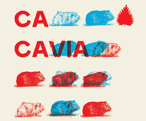
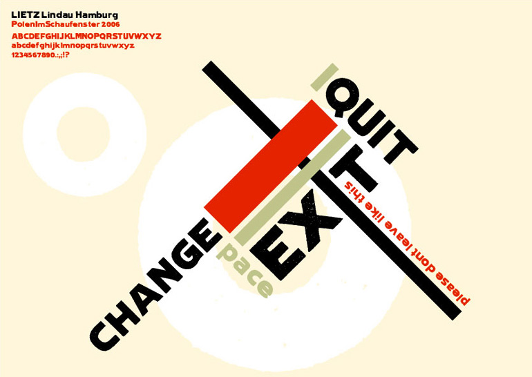
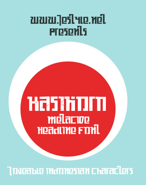
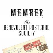
I also have a major predilection towards fonts that look hand lettered, but not in the 21st century, graffiti, handwritten sort of way. I like my fonts to look imperfect like hand painted window signs or wood block prints. So, I went to my favorite free font resource, www.dafont.com (a great find thanks to Emily B.), to pull up some examples of my preferred fonts. Although all of these images were designed as a mere showcase of how the font can be used, I'm totally tempted to blow them up and frame them in my house. Perhaps I'll make a hall of letters. I swoon.
Wednesday, July 29, 2009
Subscribe to:
Post Comments (Atom)


No comments:
Post a Comment